Quinn Dombrowski, June 5th 2023
The idea
The New Horizons in Digital Humanities & Cultural Data Science workshop at Hong Kong University, organized by Javier Cha, brought together experts in digital humanities and data science from around the world for a week of lectures and hands-on sessions on topics ranging from text annotation to multilingual text analysis to GIS and conspiracy theory networks.
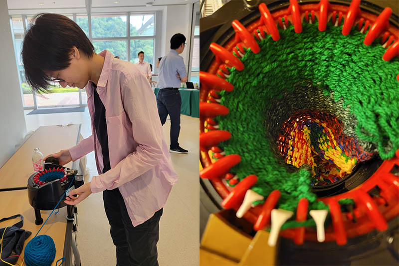
But before the workshop started, there was a day trip to Macau, which I had written my elementary school country report on and had always wanted to visit. I'd been planning a lunchtime textile data viz workshop, and had brought with me my Addi circular knitting machine along with a bunch of assorted yarn, but I didn't have a plan for what we'd make. That changed in a little cafe most of the way up the Fortaleza do Monte, where fellow instructors Gimena del Rio Riande and Melanie Walsh were discussing their travel routes to get to Hong Kong while we picked up bottles of water and enjoyed some AC. It occurred to me that the space and time of transit was a shared experience for everyone at the workshop, local or visitor, and we could represent both together.
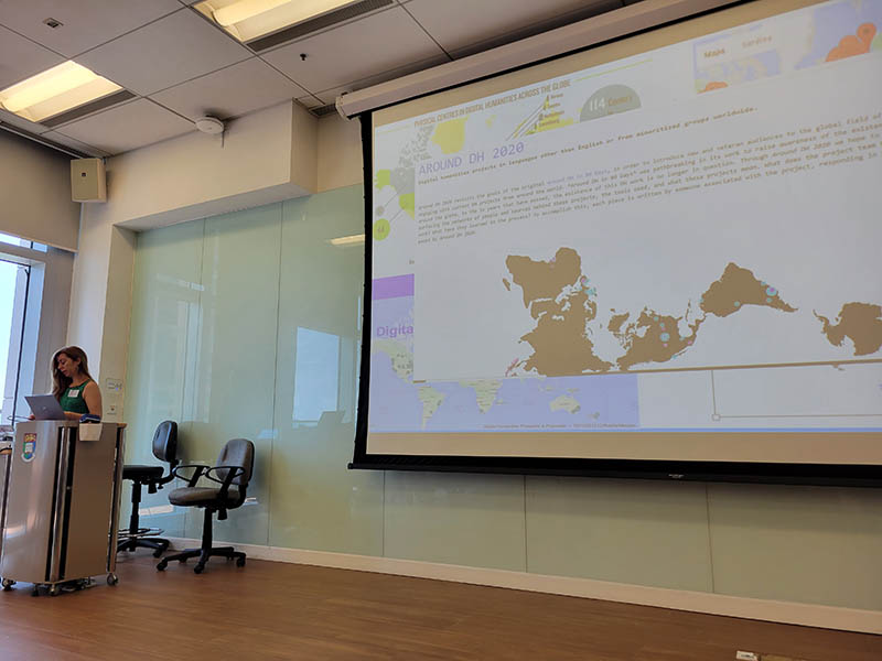
Gimena's talk on "Humanidades Digitales: A Low-Tech Approach to Digital Humanities", on the first day of the workshop, literally gave shape to the map component of the piece by reminding me of the Dymaxion map I made for the ill-fated Around DH 2020. By the time I held the textile data viz workshop at lunchtime that day, I had a plan to share: we'd fill in a survey about how long it took us to get here. That data would be a knitted rectangular base for the visualization. On top, I'd use yarn to embroider a world map (Dymaxion projection) as well as a Hong Kong map, and we'd add in people's actual routes to get to Hong Kong University.
The data
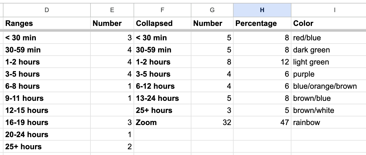
We sent out a survey later that day, with a deadline of the following day. We got 35 responses, and we added to that the 32 Zoom participants from the first day's session. For being a free-text field, the data wasn't too messy; most people answered in minutes or hours. I decided to exclude the one response that read "3 years"; I suppose "getting here" was potentially vague enough to include a more metaphorical understanding.
It took a few tries to cluster the responses down to a number of buckets that corresponded to the different yarns I had on hand. I also wanted the visualization to be roughly 100 rows of knitting; doing one per piece of data would only get me 2/3 of the way there. So I converted the responses to percentages instead of raw numbers (which I often recommend when you've got data that's either bigger or smaller than you want it to be).
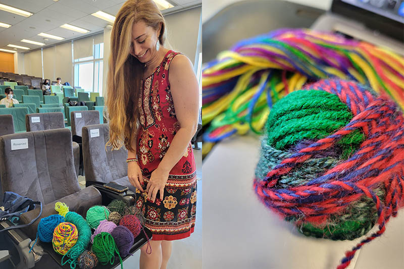
Gimena helped me pick out which colors would correspond to which data ranges. From there, I measured out each color yarn and tied it together into a data ball.
 .
.
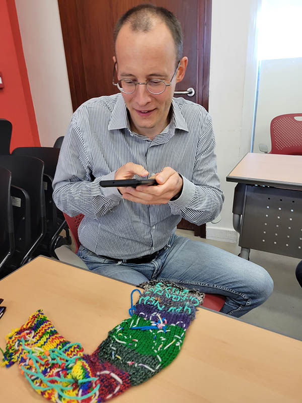
I did a demo of how to use the Addi circular knitting machine to do flat knitting, but the flat knitting is a little more challenging than circular knitting, especially for beginners. I'd hoped to have participants knit the real data, but ran out of time and ended up doing it myself in the evening. Even I struggled a little with flat knitting on the machine, and ended up having several dropped stitches and holes to patch.
The maps
Embroidery is not a textile method I use a lot, and I've struggled with it before. I also struggle with drawing, leading me to conclude that I really needed to not attempt freehand map embroidery. Student assistants printed out copies of the two maps for me at roughly the right size, and I cut them out and tried to embroider around the shapes.
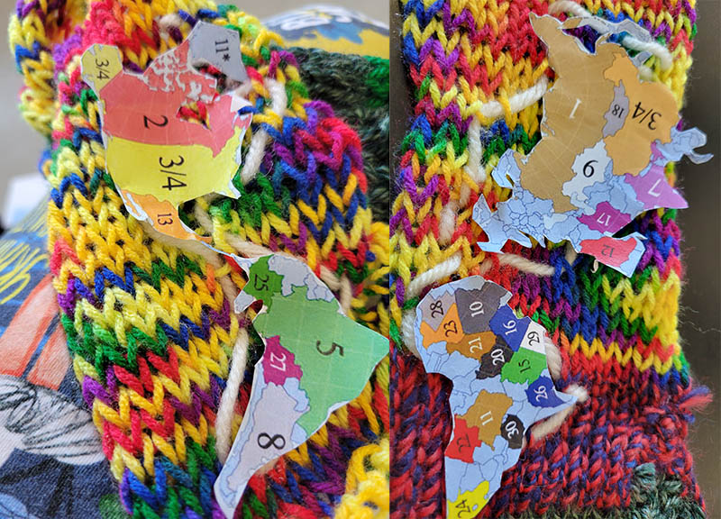
The base material created by the knitting machine introduced challenges. Cutting out the paper shapes already forced some simplification of the images (goodbye, complex coastlines!) but sometimes there just weren't enough knitted stitches to be able to render even those simplified shapes. I'd used a fairly fine yarn (rainbow-colored, representing Zoom participants), but the problem is that the circular knitting machine only has one needle gauge, optimized for thicker yarns. Several times when I was trying to render a shape, I'd realize I was stitching into the same hole I'd just stitched out of, undoing the previous stitch instead of creating a new one. The result was almost like a new projection, shaped by the materiality of its substrate.
Points on the map
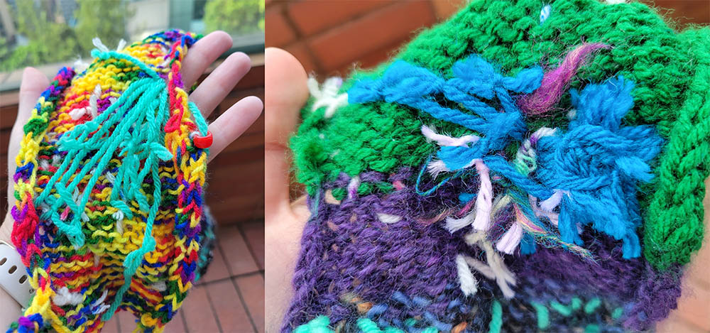
I started off using red pony beads for all the airports, but soon realized I'd run out of red pony beads and would have to switch to orange. (I'd brought various shades of red and orange, plus pink sparkles, with me on the trip; they're the least popular colors corresponding to angry/negative feelings on this year's Textile Makerspace sign-in loom.) It actually worked out to have orange as points of origin, and red as points of transfer. If a point was both origin for someone and transfer for someone else, it defaulted to orange.
Attaching the beads left me reflecting on the challenges of GIS, and things like questions of precision when geocoding data. If you think geocoding a city name is bad (it'll just put you in the center of the city, which is almost certainly what you actually want), try representing an airport using a pony bead on a loosely-knit textile with an embroidered rendering of a map in an unusual projection. Suffice it to say, the East Coast feels very crowded.
The beads also pushed the boundaries of the map and further distorted things; I transferred through Manila, which realistically should've been somewhere off the edge of the knitting. I put it on the edge instead.
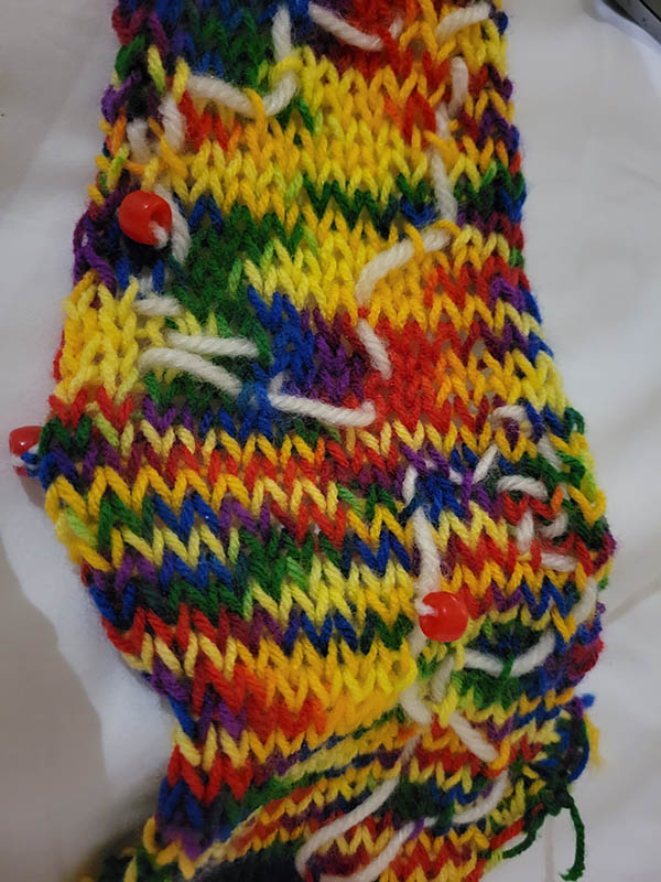
The Hong Kong airport was indicated with a pink sparkly bead on the international map, and on the Hong Kong map. Hong Kong University also got a pink sparkly bead, as it was the location of the conference.
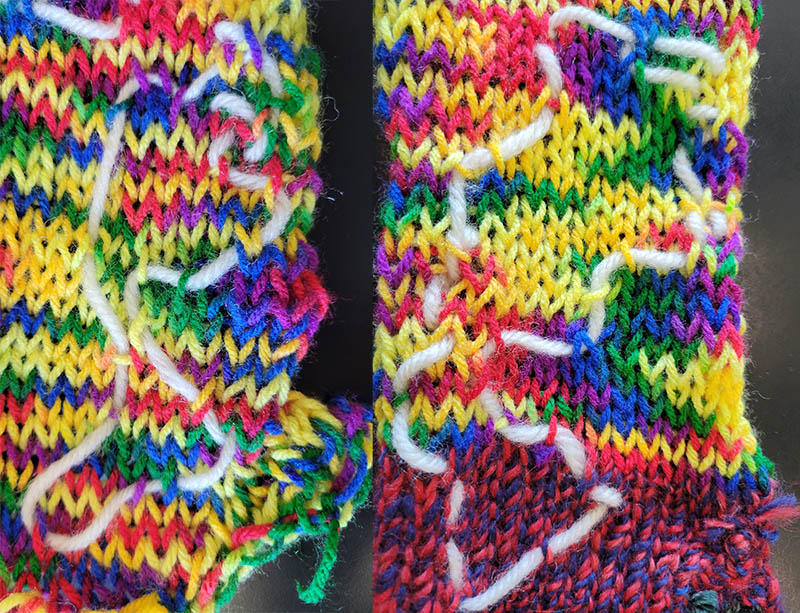
Tracing paths
I had already asked for the speakers' international flight path, and began by embroidering those on the world map. Gimena's route from Argentina to Brazil to Ethiopia involved the longest piece of path-yarn, which became a bit loose the way I tied it to the knitting. Maybe there's something in there about the way time drags on when flying across the world.
I'd decided to use turquoise for flight paths, which meant we'd need other colors for other types of travel. Over lunch, I went around asking people for their routes, and orienting them to the Hong Kong map I'd attempted to embroider. I used a darker blue for MTR (subway) transit, which was the most common among the locals. There were several walking paths that were so short I used a single (rather than plied yarn) for those. Yellow was bus, and pink was car (one each). One participant leaned into having complex data, using one means of transit to drop off his daughter, and another to go from her school to the workshop; we tied two colors of yarn together, and put the knot in the center of the path. He took a picture to share with his daughter.
Metadata
This blog post serves as the documentation for what everything on the textile data viz means, but I wanted to put a label on it so people in the future might have some sense at least of what event it corresponded to. So, once again braving the waters of embroidery, I attempted to write "HKU New Horizons 2023" on it.
The final visualization
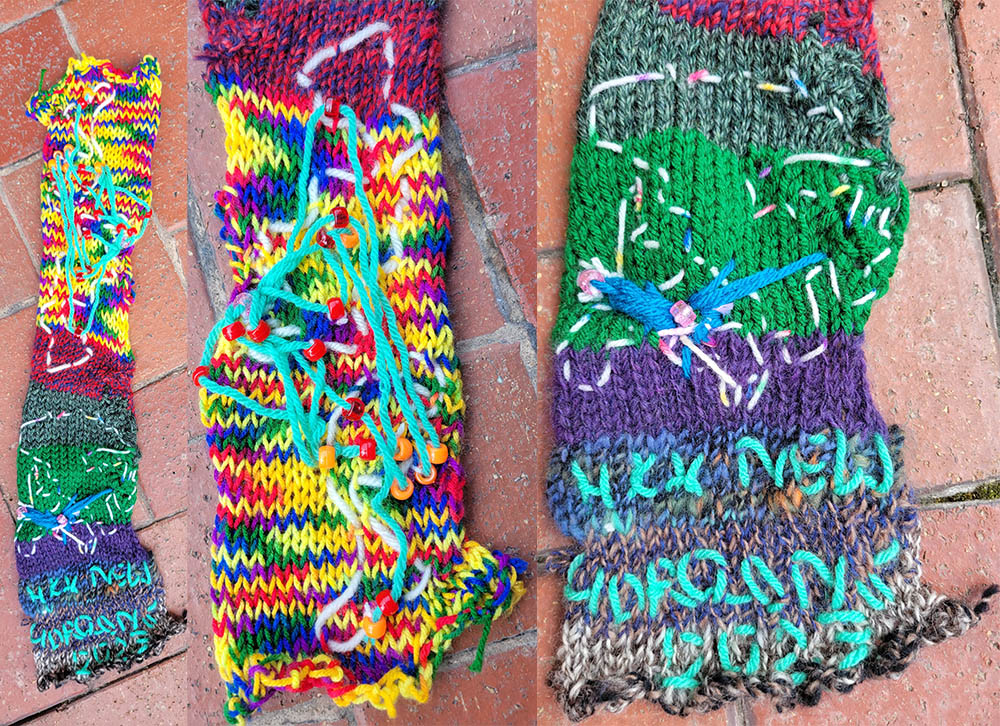 Here's the final visualization, in its entirety and with a close-up of the two sides.
And just for fun, here's the backside of data:
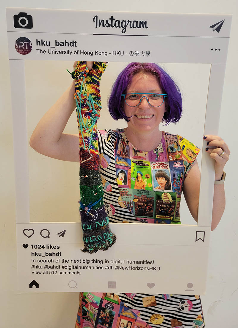
And me with the data viz, and the workshop's real-world Instagram frame:
Bonus: Material afterlives
I got too many souvenirs in Hong Kong and needed to bring a lot less yarn home with me, so I made (non-data) scarves to thank the student assistants.
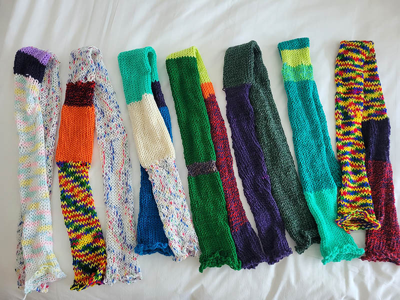
I also made one data scarf using color data, as a thank you present for Jodie Cheng who showed us around for some authentic souvenir shopping in the Sham Shui Po area on Saturday.
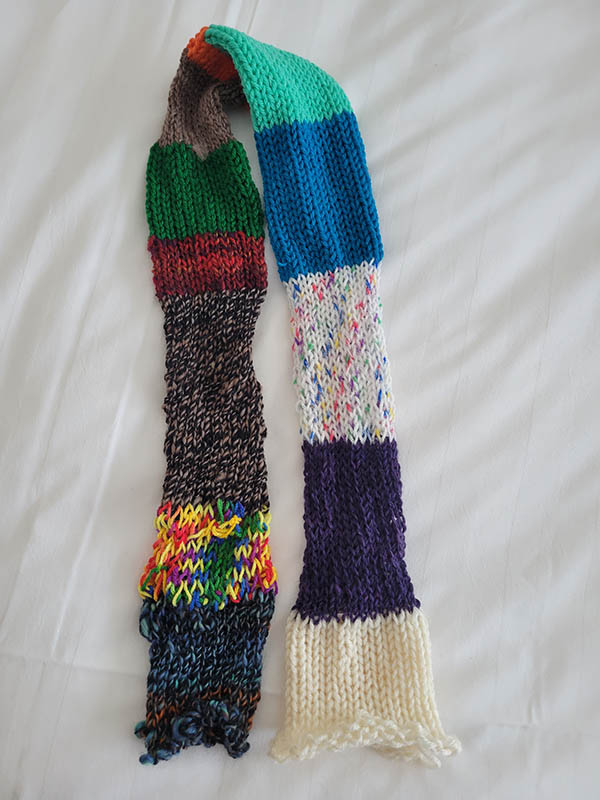
Starting from the bottom left and working up, then down the other column, the colors represent:
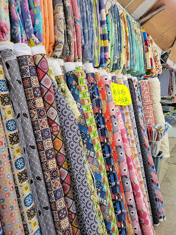
- Colorful fabrics in the Sham Shui Po textile area
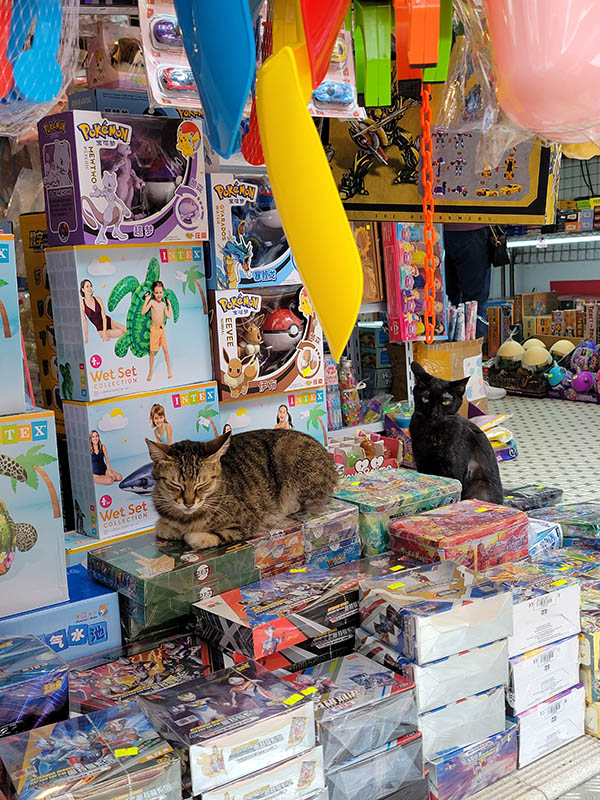
- Rainbow children's toy stands
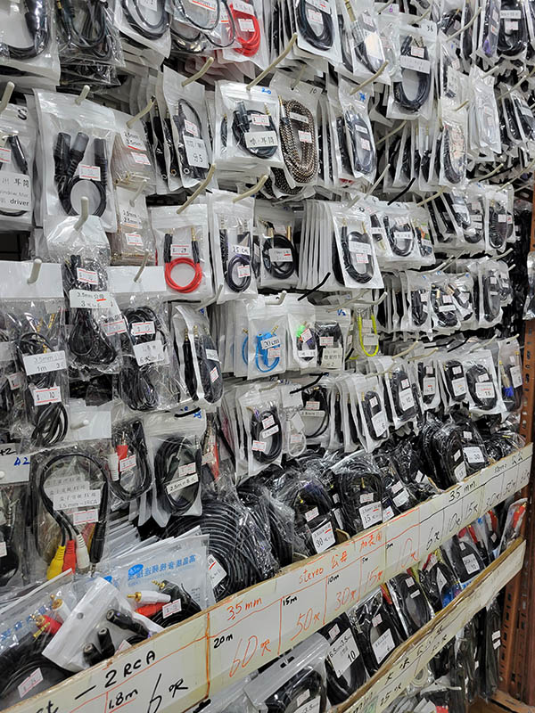
- Electronics shops in the basement (and all the dongles and wires)
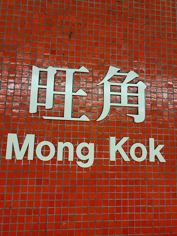
- Red Mong Kok ("Bustling Corner") MTR sign
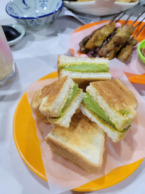
- Brown sandwiches with green pandan paste at lunch at Semua Semua
-
Orange noodles (not pictured) at lunch
-
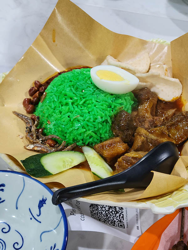
Turquoise green rice at lunch
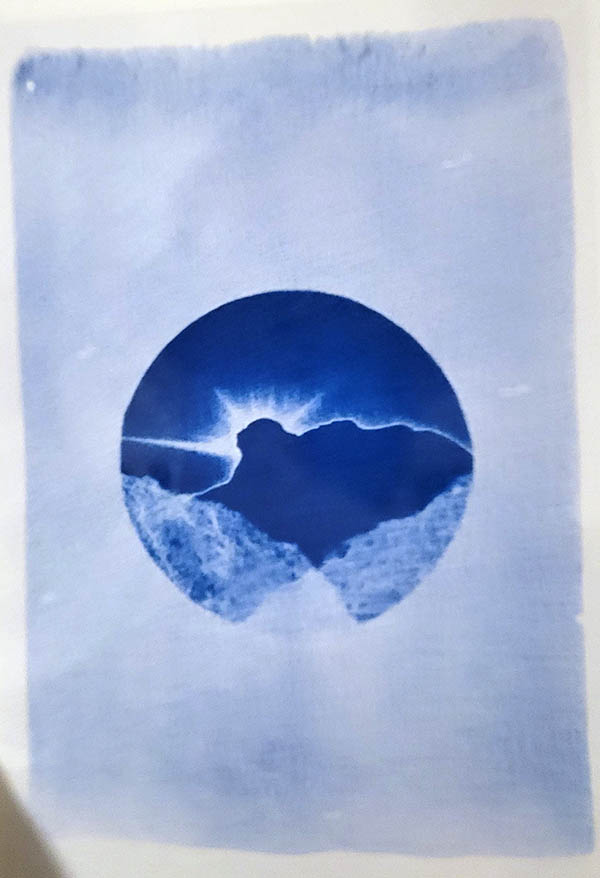
- Blue cyanotype prints of Lion Rock at a souvenir stand
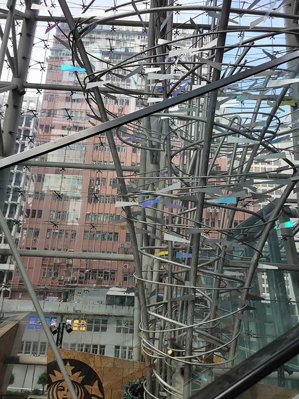
- Shiny metal and glass mall
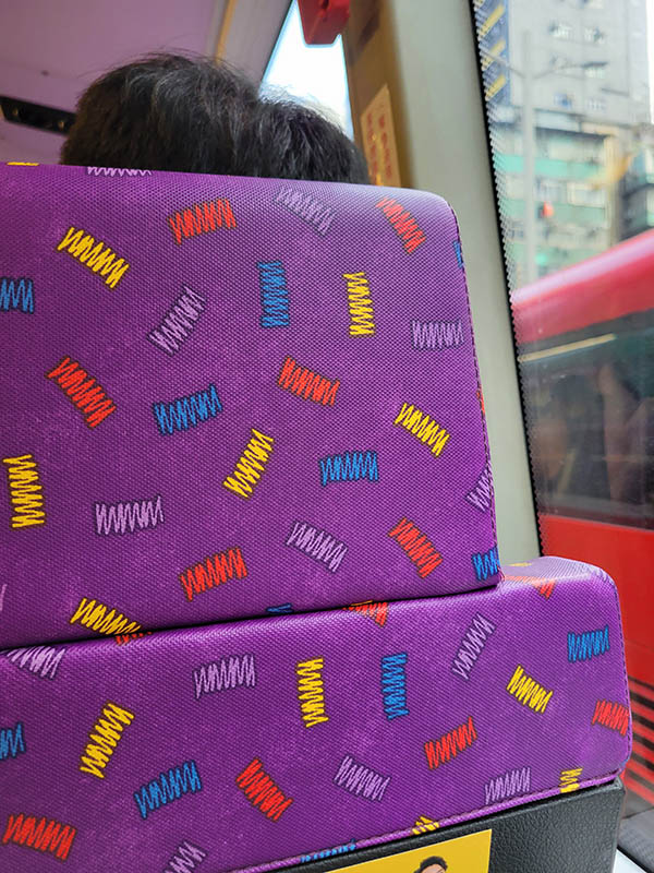
- Purple seats on the bus back
- White boba (I got lychee with cheese foam)